What Are Atomic Design Systems?
Atomic design systems are a way of building digital interfaces from small, reusable parts that combine into larger, more complex layouts. The idea comes from chemistry. Just as atoms bond into molecules and molecules form organisms, a button, a label, and an input field can combine into a search bar, which then becomes part of a full page header.
The method was introduced by designer Brad Frost. Its purpose is simple: stop designing pages one at a time and start designing a connected set of building blocks that any team member can reuse.
If you have ever noticed that the same button looks slightly different on three pages of one website, you have seen the problem this approach solves.
Why Atomic Design Systems Matter for Modern Teams
Design and development teams often struggle with the same issues: inconsistent styling, duplicated work, slow handoffs, and interfaces that become harder to maintain as they grow. A structured design system tackles all of these at once.
Here is what teams gain:
- Visual consistency. Every page draws from the same pool of components, so the brand feels unified.
- Faster production. Designers and developers reuse existing pieces instead of rebuilding them.
- Easier maintenance. Change a single component, and the update flows everywhere it appears.
- Better collaboration. A shared vocabulary helps designers, developers, and content teams talk about the interface in the same terms.
- Scalability. New features and pages can be assembled quickly without starting from zero.
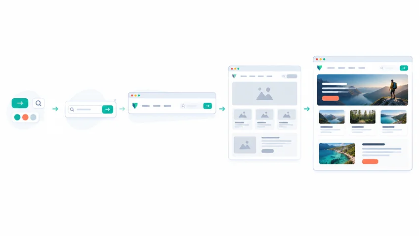
The Five Stages of Atomic Design
The methodology organizes your component library into five levels. Understanding each one makes the whole structure easier to apply.
1. Atoms
Atoms are the smallest functional elements of an interface. Think of HTML basics: buttons, input fields, labels, icons, headings, and color swatches. On their own they do little, but they define your core design tokens such as typography, spacing, and color.
2. Molecules
Molecules are simple groups of atoms that work together as one unit. A label, an input field, and a submit button together form a search form. Each part is an atom, but the combination has a clear purpose.
3. Organisms
Organisms are larger, more complex sections built from molecules and atoms. A site header with a logo, navigation menu, and search form is a classic example. Organisms are where an interface starts to look recognizable.
4. Templates
Templates arrange organisms into the layout of a page. They show structure and content hierarchy without real content, much like a wireframe, so teams can focus on how the page is organized.
5. Pages
Pages are templates filled with real content. This is the final stage, where you test whether the system holds up with actual text, images, and data. If a headline runs long or a product name breaks the layout, pages reveal it.
Build Atomic Design Systems Step by Step
You do not need to rebuild everything at once. A gradual approach works best.
Step 1: Audit your current interface. Collect screenshots of buttons, forms, cards, and navigation across your product. Note every variation. This interface inventory usually exposes surprising inconsistencies.
Step 2: Define your design tokens. Establish the foundations: color palette, type scale, spacing units, border radius, and shadows. These tokens become the DNA of every component.
Step 3: Create your atoms. Design and code the smallest elements first, including their states, such as hover, focus, disabled, and error.
Step 4: Combine atoms into molecules and organisms. Build up gradually, testing each component in isolation before it joins a larger one.
Step 5: Document everything. A component library without documentation will not be used. Write short guidance on when to use each component, how it behaves, and how it supports accessibility.
Step 6: Maintain and evolve. A design system is a living product. Assign ownership, gather feedback, and review it regularly so it stays useful.
Tools That Support Component-Based Design
Several tools help teams create and manage a reusable component library. Design tools like Figma allow shared components and variables, while Storybook lets developers build, preview, and test UI components in isolation. Pairing a design tool with a coded component library keeps design and development aligned and reduces handoff friction.
Common Mistakes to Avoid
- Over-engineering early. Start with the components you actually use, not every possible variation.
- Treating the five stages as rigid rules. The hierarchy is a mental model. Some teams find the line between a molecule and an organism blurry, and that is acceptable if the team agrees on a shared approach.
- Skipping accessibility. Color contrast, keyboard navigation, and screen reader support should be built into atoms from the start.
- Neglecting governance. Without clear ownership, a system slowly drifts back into inconsistency.
- Ignoring content. Components that look good with placeholder text can fail with real copy, so test with realistic content early.
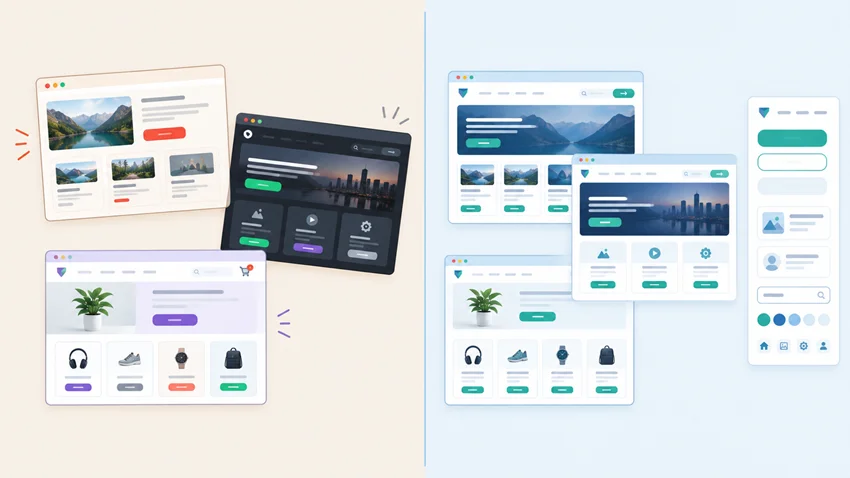
Atomic Design vs. Traditional Page-Based Design
In page-based design, each screen is crafted individually. This feels fast at first, but it creates duplicated work and a patchwork of styles over time. A component-driven approach flips the process: you build the system first, then assemble pages from it. The upfront effort is higher, but long-term speed, consistency, and quality improve significantly, especially for growing products and larger teams.
Frequently Asked Questions
What is an atomic design system in simple terms?
It is a method of designing interfaces as a hierarchy of reusable components, starting with small elements like buttons and building up to complete pages.
Who created atomic design?
Brad Frost introduced the methodology as a way to make interface design more systematic and consistent.
Is atomic design only for large companies?
No. Small teams and solo designers benefit too, because reusable components save time and keep a growing website tidy.
What is the difference between a design system and a style guide?
A style guide documents visual rules such as color and typography. A design system includes those rules plus coded components, usage guidelines, and governance.
How long does it take to build one?
It depends on the size of your product. Many teams start with a small core set of components and expand over several months.
Conclusion
Atomic design systems give teams a clear, repeatable way to create interfaces that look consistent, scale smoothly, and stay easy to maintain. Start by auditing what you already have, define your core tokens, and build outward from atoms to pages. Document as you go, and treat the system as something that grows with your product.
You do not need a perfect system on day one. You need a solid foundation and the habit of improving it.
Want more practical guides on design, development, and digital growth? Learn more about our website and explore our latest resources. Ready to put these ideas into action or need help with your own project? Click here to get in touch with our team.