Scroll through any feed for ten seconds and you will notice something: most posts disappear from your memory instantly, while a few make you pause. The difference is rarely luck. It is usually design.
Social media graphic design is the practice of creating images, carousels, short-video covers, and templates that are built to be seen, understood, and remembered inside a fast-moving feed. It blends visual branding, clear messaging, and platform-specific formatting so a post can earn attention in under two seconds.
This guide walks you through the principles, formats, tools, and habits that make visual content work, whether you are a small business owner, a freelancer, or a marketer managing several brand accounts.
What Is Social Media Graphic Design, Really?
At its simplest, it is visual communication made for social platforms. Unlike a poster or a brochure, your design competes with friends’ photos, news, memes, and ads. People decide in a flash whether to stop, swipe, or scroll on.
That is why good social media graphics are:
- Instantly readable. One idea per image, with text large enough for a phone screen.
- On brand. Colors, fonts, and style that people recognize before they read your name.
- Platform-aware. Sized and cropped for the place they will appear.
- Purposeful. Every post nudges the viewer toward a like, save, share, comment, or click.
Think of it as a handshake. Your visuals introduce your brand before a single word of your caption is read.
Why Visual Content Matters for Brand Growth
People process images far faster than paragraphs, and feeds reward posts that hold attention. Strong visuals can help you:
- Build recognition. Consistent visual branding makes your posts identifiable even without a logo.
- Increase engagement. Clear, attractive designs tend to earn more saves, shares, and comments.
- Communicate trust. Polished, tidy graphics signal that a business is active and professional.
- Simplify complex ideas. Infographics and carousel posts turn dense information into easy steps.
- Support your marketing goals. From launching a product to promoting an event, design gives every campaign a recognizable look.
The Core Principles Behind Great Social Media Graphics
You do not need to be a trained designer to apply these. You only need to be intentional.
1. Visual hierarchy
Decide what the eye should see first, second, and third. Usually that is a headline, then a supporting visual, then a small call to action. Use size, weight, and contrast to guide the order.
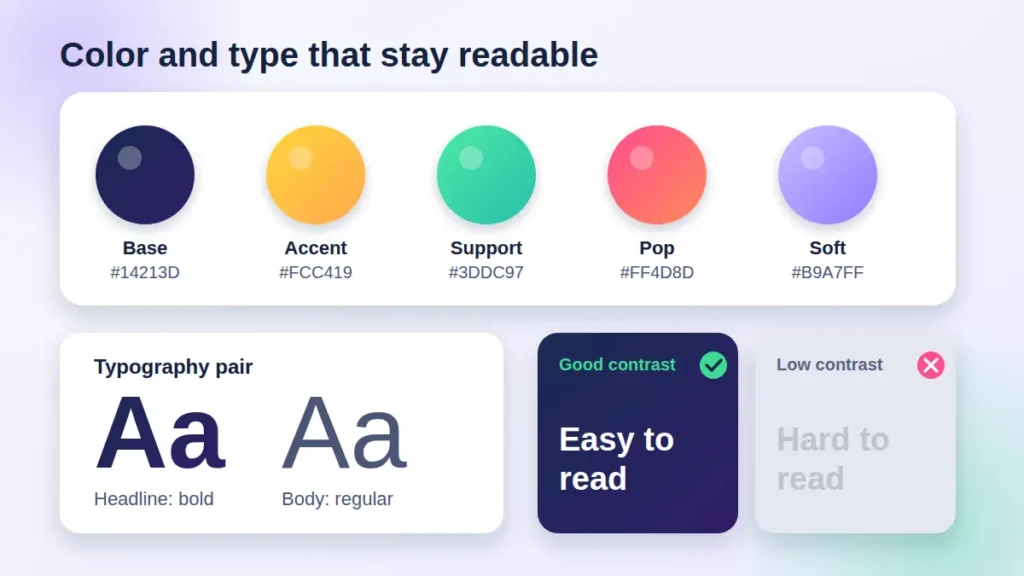
2. A limited color palette
Choose two or three main colors plus a neutral. Make sure your text has strong contrast against the background, since many people view posts on small screens in bright light.
3. Typography that works on mobile
Pick one bold font for headlines and one clean font for supporting text. Avoid decorative scripts for important information. If you have to squint, your audience will simply keep scrolling.
4. Whitespace
Empty space is not wasted space. It gives your message room to breathe and makes the design feel confident instead of crowded.
5. Consistency
Repeating layouts, fonts, and color choices across posts creates a recognizable feed. Brand guidelines and reusable post templates make this effortless, even when several people create content.
6. Strong focal imagery
Use original photography, clean illustrations, or well-chosen icons. Overused stock images can make a brand feel generic, so pick visuals that reflect your real products, people, and personality.
Format and Size Guide for Popular Platforms
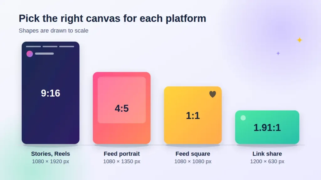
Platforms update their layouts from time to time, so always double-check the current specifications before exporting. These commonly used dimensions are a reliable starting point:
| Platform and format | Common size (pixels) | Best use |
| Instagram feed (portrait) | 1080 x 1350 | Takes up more screen space, ideal for carousels |
| Instagram feed (square) | 1080 x 1080 | Quotes, announcements, product shots |
| Instagram and Facebook stories, Reels covers | 1080 x 1920 | Full-screen vertical content |
| Facebook link or shared image | 1200 x 630 | Blog and article promotion |
| LinkedIn post image | 1200 x 627 | Professional insights, company updates |
| X (Twitter) image | 1600 x 900 | Wide visuals, announcements |
| Pinterest pin | 1000 x 1500 | Tutorials, ideas, product inspiration |
| YouTube thumbnail | 1280 x 720 | Click-worthy video previews |
Mobile-first tip: Keep key text and faces away from the edges. Apps place buttons, captions, and profile icons over parts of your image, and crops differ between the grid and the feed.
A Simple Step-by-Step Process You Can Follow
- Define the goal. Do you want awareness, clicks, sign-ups, or saves? One post, one goal.
- Know your audience. Think about what they scroll for, what problem they have, and what tone feels natural to them.
- Write the message first. A short headline of about six to ten words works well. Cut anything that does not earn its place.
- Choose the format. A single image, a carousel, a story, or a short-video cover each suit a different goal.
- Build from a template. Start with your brand colors, fonts, and layout, then adjust for the specific message.
- Check the details. Zoom out to phone size, test the contrast, and confirm nothing is cut off.
- Add a clear call to action. Tell people what to do next, such as save this, swipe for tips, or visit the link in bio.
- Publish, measure, and refine. Look at reach, saves, shares, and click-throughs, then keep what works.
Tools That Make Visual Content Easier
The right tool depends on your skill level and workflow:
- Canva and Adobe Express: beginner-friendly, with ready-made templates and quick resizing.
- Figma: great for teams that want shared components and a consistent design system.
- Adobe Photoshop and Illustrator: powerful options for custom illustration, photo editing, and detailed brand assets.
- Mobile editing apps: useful for quick story updates and on-the-go content creation.
Whichever you choose, build a small library of reusable templates. It saves hours every week and keeps your feed looking cohesive.
Common Mistakes to Avoid
- Too much text. If a post reads like a paragraph, it belongs in the caption.
- Low contrast. Light gray text on a white background looks stylish but is hard to read.
- Ignoring safe zones. Important details get covered by interface elements.
- Mixing too many styles. Five fonts and eight colors make a brand feel scattered.
- Using blurry or stretched images. Always export at the correct size and resolution.
- Skipping accessibility. Add alt text where the platform allows it, and avoid relying on color alone to convey meaning.
Make Your Graphics Work Harder With Accessibility and Search
Visuals are not only for the feed. Descriptive file names, alt text, and clear on-image text help people using screen readers and also give search engines more context. When you repurpose a graphic on your website or blog, pair it with helpful, original writing around it. Google’s guidance continues to reward people-first content that shows real experience, so let your own insights, examples, and results shine through.
How to Know If Your Design Is Working
Track the numbers that match your goal:
- Reach and impressions show how far a post traveled.
- Saves and shares reveal content people find genuinely useful.
- Comments signal conversation and interest.
- Link clicks and profile visits show whether the design drove action.
- Retention on carousels and stories tells you where people lose interest.
Compare similar posts, change one element at a time, such as the headline, color, or layout, and note what lifts results. Over a few weeks, patterns appear.
Frequently Asked Questions
What is social media graphic design?
It is the creation of branded visuals, such as images, carousels, story slides, and templates, that are optimized for how people view content on social platforms. The goal is to grab attention quickly and communicate a message clearly.
What makes a social media graphic effective?
A clear focal point, readable text, consistent branding, correct dimensions, and a single, simple message. Effective designs also include a call to action.
Do I need design experience to create good posts?
No. With beginner-friendly tools, a defined color palette, and a few reusable templates, anyone can produce professional-looking visuals. Practice and feedback will sharpen your eye.
How often should I post new graphics?
Consistency matters more than volume. Pick a rhythm you can maintain, then use a content calendar to plan themes, campaigns, and formats in advance.
Which format performs best: carousels, single images, or stories?
It depends on your goal. Carousels suit education and storytelling, single images work for quick announcements, and stories are great for timely updates and behind-the-scenes moments. Test each one with your own audience.
Final Thoughts: Design With Purpose, Not Pressure
Great visual content is not about chasing every trend. It is about knowing who you are speaking to, saying one clear thing, and presenting it in a way that feels unmistakably yours. When your colors, fonts, layouts, and messages work together, your feed becomes a brand experience people recognize and remember.
Start small. Pick one platform, build three templates, and publish consistently for a month. Review what resonates, refine your approach, and keep going. That steady, thoughtful habit is what turns a good-looking post into lasting growth.