UI/UX design secrets that improve user experience, build trust, and increase conversion rates. Learn actionable design techniques to turn visitors into paying customers.
UI/UX Design Secrets That Increase Your Conversion Rates
Your website or app might look beautiful — but beauty alone doesn’t convert. High conversion rates come from strategic and thoughtful UI/UX design that guides users smoothly, builds trust, and encourages action.
Today, businesses depend heavily on user experience. When visitors enjoy navigating your site, they stay longer, explore more, and feel confident enough to buy or contact you. Good design is now a business strategy, not just decoration.
In this article, you’ll learn powerful UI/UX design secrets that truly improve conversion rates and help your digital product perform better than your competitors.
The Foundation: Understanding the Conversion Funnel
Before optimizing, you must first understand the user journey. The conversion funnel describes the multi-step path a user takes, from first awareness to final action. A successful design smooths this path at every stage.
Identifying Conversion Killers (Friction)
Friction is anything that makes a user hesitate, feel confused, or requires them to put in extra effort. It’s the primary conversion killer. Examples include overly long forms, unclear navigation, slow load times, and vague Call-to-Action (CTA) buttons. The core UI/UX design secret here is: simplicity always wins.
The Role of Cognitive Load
Cognitive load refers to the mental effort required to use your site. When a design is cluttered, uses complex jargon, or forces the user to remember information across multiple pages, the cognitive load spikes. A high load leads to frustration and abandonment. Your design goal should be to minimize this load, making every decision easy and immediate.
Secret 1: Mastering Visual Hierarchy and Attention
Users don’t read; they scan. Effective UI/UX design controls what a user sees and when they see it, ensuring their focus lands on the elements that drive conversion. This is the essence of visual hierarchy.
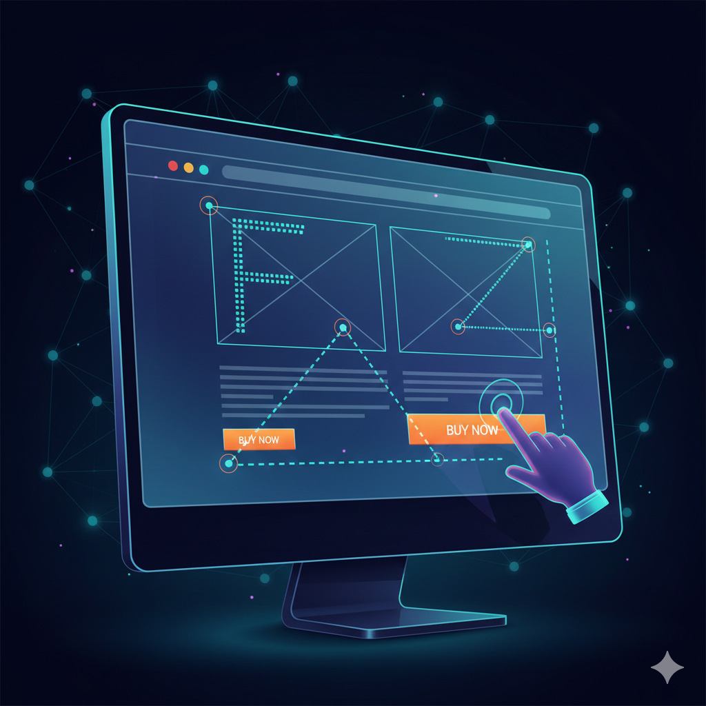
F-Patterns, Z-Patterns, and How Users Scan
Eye-tracking studies reveal predictable scanning patterns. On text-heavy pages, users often follow an F-pattern, focusing on the top, left side, and initial words of paragraphs. On pages with less text, like landing pages, the Z-pattern is common, moving across the top, diagonally to the middle, and then across the bottom. Place your most critical information and CTAs along these paths to maximize visibility.
Color Psychology and the Power of Contrast
Use color not just for style, but for action. The secret is to reserve a single, contrasting color—your action color—exclusively for your CTAs and key conversion elements. This high-contrast approach immediately draws the eye, overcoming the “blindness” users often develop to common interface elements. Your primary brand color should be distinct from your action color.
Secret 2: The Art of Frictionless Interaction
The less work a user has to do, the higher the conversion rates. Frictionless interaction is about anticipating user needs and removing every possible hurdle.
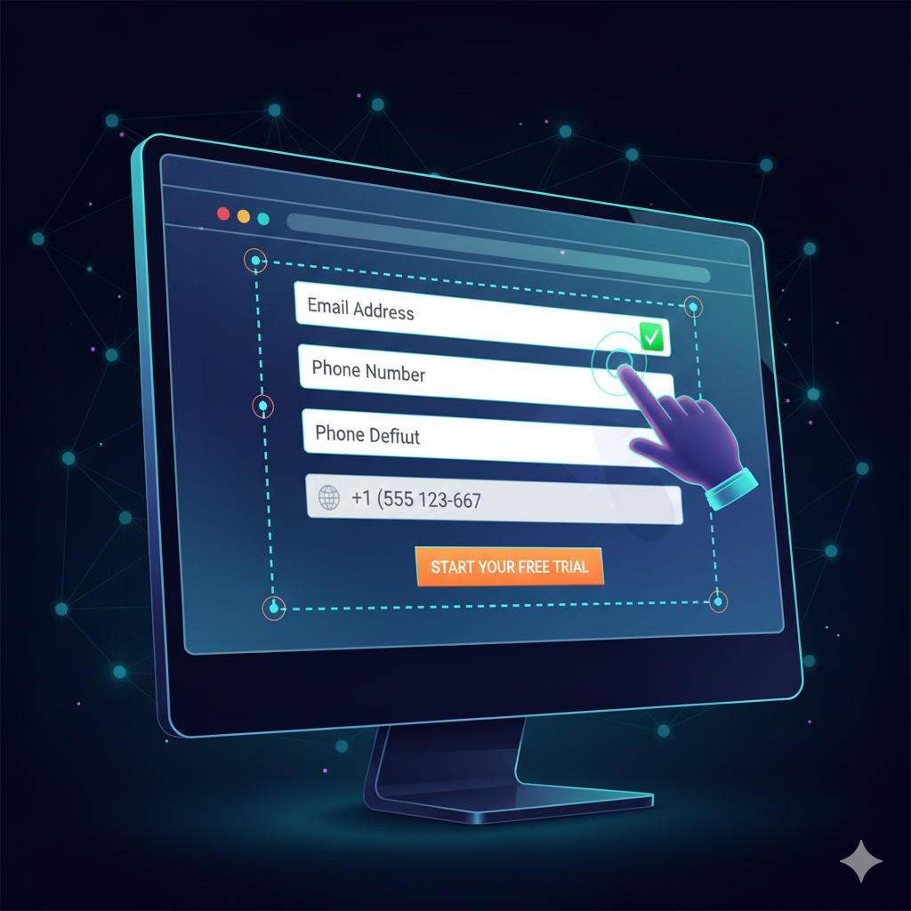
Optimizing Forms and Input Fields (The Dreaded Chore)
Forms are necessary, but they are a major point of friction. The design secret is to use inline validation (showing a green checkmark or red error as the user types, not after they submit) and smart defaults (pre-filling fields based on geo-location or past data). Furthermore, use a single-column layout and label fields above the input box, as this arrangement allows the eye to flow vertically, minimizing horizontal scanning effort.
The Magic of Microcopy and Clarity
Microcopy is the small text on your site that guides users—button labels, error messages, and helpful hints. Replace generic, passive language with action-oriented, reassuring microcopy. Instead of “Submit,” use “Get Your Free E-book” or “Start My 30-Day Trial.” This tiny UI/UX design secret provides clarity and reduces anxiety, leading to a massive boost in conversion.
Secret 3: Designing the Perfect Call-to-Action (CTA)
A CTA is where the conversion happens. It must be impossible to ignore, clear in its intention, and compelling enough to warrant a click.
Context is King: Placing CTAs Strategically
A CTA must appear precisely at the moment the user has enough information to make a decision. On product pages, place one clearly above the fold (the visible area without scrolling) and repeat it after a block of compelling information, such as testimonials or feature descriptions. This ensures the CTA is available regardless of the user’s scanning depth.
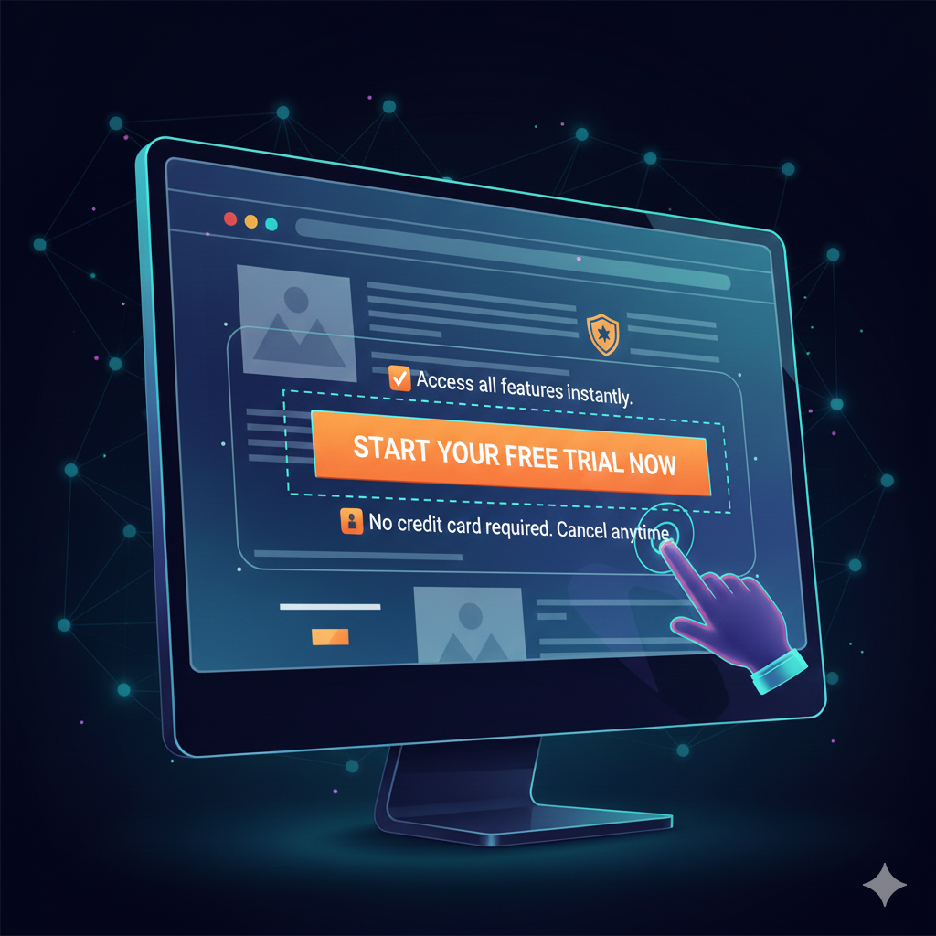
Action-Oriented Language and Urgency
Instead of merely describing what they will get, use language that inspires immediate action and ownership. Words like “My,” “Yours,” “Now,” and “Instantly” are powerful. For example, “Start Your Free Course Now” is more compelling than “Sign Up for Free Course.” Injecting a sense of urgency (limited-time offers, scarcity warnings) can significantly push lukewarm prospects to convert.
Secret 4: Trust, Credibility, and Social Proof
Users will not hand over their money or information unless they trust your brand. UI/UX design can be leveraged to build this trust immediately.
Strategically Placing Testimonials and Reviews
Social proof is the most powerful trust signal. Don’t hide your best testimonials on a separate page. Integrate them directly near the corresponding conversion element. On a landing page, place a high-profile testimonial right next to the signup form. Authenticity is key: use photos and full names if possible.
Minimizing Security Anxiety (Certifications & Badges)
A simple, often overlooked secret is the strategic placement of security badges (SSL, Payment Verified, etc.). Place these small badges directly beneath or adjacent to sensitive input fields, such as credit card forms or email collection boxes. This simple visual cue reduces security anxiety and reinforces that the transaction is safe.

The Secret Weapon: Testing, Analyzing, and Iterating
The final, and most profound, UI/UX design secret is that no one gets it 100% right on the first try. Top performers view their conversion rate optimization (CRO) efforts as a continuous cycle of testing and refinement.
Setting Up Effective A/B Tests
Never assume what users want; test it. A/B testing allows you to compare two versions of a design element (e.g., CTA color, headline wording, form length) to see which performs better. Focus your testing on high-impact areas first, such as the homepage or checkout page, and always test only one variable at a time.
Interpreting User Behavior Data
Tools like heatmaps and session recordings are indispensable for understanding why users aren’t converting. Heatmaps show where users click and scroll, revealing areas of confusion or missed opportunities. Observing real session recordings provides context to your analytics, helping you identify the exact moment a user abandoned the funnel due to a design flaw.By systematically applying these UI/UX design secrets—from managing cognitive load and perfecting microcopy to mastering visual hierarchy—you are not just creating a good-looking website; you are building a finely tuned conversion machine. The pursuit of frictionless experience is the ultimate key to skyrocketing your conversion rates.