Every time someone opens an app or visits a website, they’re silently judging it within seconds is this easy? Does this make sense? Should I stay or leave? That silent judgment is the entire game of user interface (UI) design and user experience (UX) design. Get it right, and people stay, trust you, and come back. Get it wrong, and no amount of clever marketing will save you.
This guide breaks down the core UI/UX design principles, usability best practices, and user-centered design tips that separate forgettable products from ones people genuinely enjoy using.
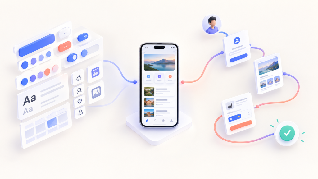
What Is UI/UX Design?
UI design covers the visual and interactive layer of a product, including buttons, color palettes, typography, icons, and layout. UX design covers the full user journey and how intuitive, efficient, and satisfying it feels to reach a goal within that product.
They’re different disciplines, but they succeed or fail together. A visually stunning interface with a confusing checkout flow will still lose customers. A perfectly logical flow wrapped in outdated visuals will still feel untrustworthy. Strong digital products need both usability and visual design working as one system.
Core UI/UX Design Tips
1. Design for Clarity Over Decoration
Users scan interfaces; they don’t read them line by line. Strip away anything that doesn’t serve a clear purpose. Every screen should answer one question for the user: what am I supposed to do here?
2. Build a Strong Visual Hierarchy
Use size, color, contrast, and spacing to guide attention naturally headline first, primary action next, and supporting details last. Good visual hierarchy reduces mental effort and speeds up decision-making.
3. Keep Design Patterns Consistent
Repeating the same button styles, spacing, and navigation logic across a product builds familiarity and trust. A design system a shared library of reusable UI components, keeps consistency intact as your product grows.
4. Make Accessibility Non-Negotiable
Accessible design (proper color contrast, readable font sizes, keyboard navigation, alt text) isn’t a bonus feature it’s part of good UX. Following WCAG accessibility standards widens your audience and often improves usability for every user, not just those with disabilities.
5. Design Mobile-First
Since most traffic now comes from phones, start there. Mobile-first design forces prioritization: bigger tap targets, simplified navigation, and content that doesn’t require zooming or pinching to read.
6. Minimize Friction in User Flows
Map your critical paths sign-up, checkout, onboarding, and cut every unnecessary step. Fewer form fields, smarter defaults, and clear feedback after each action all reduce user drop-off.
7. Use Whitespace as a Design Tool
Empty space isn’t wasted space. It improves readability, highlights key elements, and gives interfaces breathing room. Cramped layouts unintentionally increase cognitive load.
8. Write Human Microcopy
Small text error messages, button labels, empty states shapes how users feel in critical moments. “We couldn’t find that page” builds more trust than “Error 404” Clear UX writing is an underrated conversion lever.
9. Validate With Real Users, Not Assumptions
Usability testing, A/B testing, and behavior analytics reveal what design theory can’t. Watching a real person struggle with a flow you assumed was obvious is one of the fastest ways to improve a product.
10. Design for Emotion, Not Just Function
Thoughtful micro-interactions, smooth transitions, and a warm visual tone turn a functional tool into an experience people enjoy, and enjoyment drives loyalty far more than pure efficiency does.

Common UI/UX Mistakes to Avoid
- Overloading a single screen with too much information
- Inconsistent navigation or component styling across pages
- Ignoring loading states, errors, and edge cases
- Designing without real user research or testing
- Chasing visual trends at the expense of usability
Frequently Asked Questions
What’s the difference between UI and UX design?
UI design deals with how a product looks and how users interact with individual elements like buttons and menus. UX design deals with the entire journey a user takes to reach their goal, including how easy, efficient, and satisfying that journey feels from start to finish.
What makes good UI/UX design?
Good UI/UX design is clear, consistent, accessible, and free of unnecessary friction. It anticipates what users need before they ask, removes confusing steps, and communicates through both visuals and language in a way that feels natural rather than forced.
Why does UI/UX design matter for a website or app?
Strong UI/UX design directly affects trust, engagement, and conversions. When a product feels intuitive and respects a person’s time, users are far more likely to stay, return, and recommend it to others.
How can I improve UI/UX without doing a full redesign?
Start small: fix one confusing flow, tighten up microcopy, close accessibility gaps, or improve visual hierarchy on your busiest pages. Incremental, feedback-driven improvements often deliver more value than a complete redesign.
How do I know if my UI/UX design is actually working?
Watch what users do, not just what they say. Usability testing, session recordings, drop-off rates, and support tickets reveal real friction points that surveys and assumptions often miss.
Conclusion
Great UI/UX design isn’t about chasing trends it’s about removing friction between a user and their goal. Clarity, consistency, accessibility, and empathy are principles that hold up regardless of platform, industry, or design fad. Pick one or two tips from this guide, apply them to your current project, and pay attention to how users respond. Small, thoughtful improvements compound over time into a product people trust, enjoy, and keep coming back to because in the end, design isn’t just about how something looks. It’s about how it makes people feel.