Mobile app interface design is the process of shaping the screens, buttons, icons, text, colors and gestures a person uses inside an app. Good design makes every action feel obvious, fast and comfortable on a small touchscreen.
Think about the last app you deleted. It was probably not because it lacked features. It was more likely because it felt confusing, cluttered, or slow to figure out. That is the real power of interface design: it decides whether people stay or leave within the first few taps.
This guide walks you through the principles, patterns and habits that separate polished apps from frustrating ones. Whether you are a designer, a developer, or a founder planning your first product, you will find practical steps you can use right away.
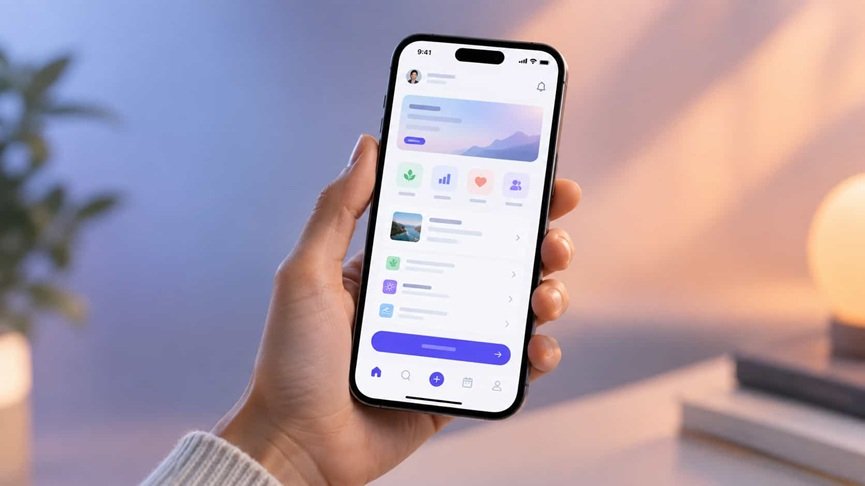
What Is Mobile App Interface Design?
Mobile app interface design, often called mobile UI design, covers everything a user sees and touches on their phone: layout, navigation bars, buttons, forms, icons, typography, spacing, color and animation.
It is closely related to UX design, but they are not the same thing:
- UI (user interface) is how the app looks and responds.
- UX (user experience) is how the whole journey feels, from opening the app to finishing a task.
A beautiful screen with a confusing flow still fails. A clear flow with an ugly screen also fails. Strong apps get both right.
Why Interface Design Matters for Your App
People decide quickly. A screen that feels clean and predictable builds trust in seconds, while a crowded one creates doubt. Here is what solid design does for your product:
- Improves retention. Users return to apps that feel effortless.
- Reduces support requests. Clear labels and guided steps mean fewer confused users.
- Boosts conversions. Simple sign-up, checkout and onboarding flows lead to more completed actions.
- Strengthens your brand. Consistent visuals make your app memorable.
9 Core Principles of Great Mobile UI Design
1. Put the Most Important Action First
Each screen should have one main job. If the goal is booking a ride, the booking button should be the clearest thing on the page. Use size, color and position to guide the eye toward it.
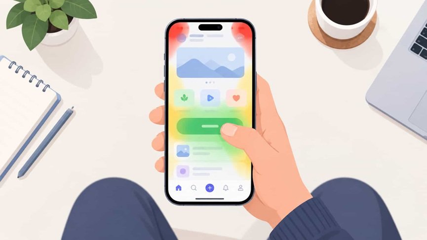
2. Design for Thumbs, Not Cursors
Most people use phones one-handed. The easiest area to reach is the lower middle of the screen, so place frequent actions there. Keep touch targets at least 44×44 points on iOS or 48×48 dp on Android so taps don’t miss.
3. Keep Navigation Simple and Predictable
Users should always know where they are, where they can go and how to go back. Common patterns include:
- Bottom tab bar: best for three to five main sections.
- Navigation drawer: useful for apps with many secondary sections.
- Gestures: swiping, pulling to refresh and long-pressing add speed, but always provide a visible alternative.
4. Use Visual Hierarchy
Hierarchy tells the eye what to read first, second and third. You create it with size, weight, contrast and spacing. When everything is bold, nothing stands out.
5. Choose Readable Typography
Body text should generally be 16px or larger. Stick to one or two typefaces, and use weight and size (not more fonts) to create structure. Short lines and generous line spacing make reading on a small screen far less tiring.
6. Build a Purposeful Color System
Pick a primary color, a secondary accent and neutral tones for backgrounds and text. Use color to communicate meaning: green for success, red for errors, blue for links. Make sure text has strong contrast against its background, with a ratio of at least 4.5:1 for normal text under WCAG guidelines.
7. Give Users Clear Feedback
Every tap deserves a response. Buttons should change state, loading should show progress, and errors should explain what went wrong and how to fix it. Subtle micro-interactions reassure users the app heard them.
8. Stay Consistent
Use the same icons, spacing, button styles and wording throughout. A design system or component library keeps everything aligned, especially when several people work on the same product.
9. Design for Accessibility From Day One
Accessibility is not an extra. It helps everyone, including people using their phone in bright sunlight or with one hand full. Support dynamic text sizes, screen readers, sufficient contrast and clear focus states. Never rely on color alone to convey information.
iOS vs Android: Follow Platform Conventions
Users build habits around their operating system, and breaking those habits creates friction.
| Area | iOS (Human Interface Guidelines) | Android (Material Design) |
| Back navigation | Swipe from the left edge or top-left button. | System back gesture or button |
| Primary action | Often in the navigation bar | Floating action buttons are common. |
| Typography | San Francisco | Roboto |
| Alerts and dialogs | Centered, minimal | Material-style dialogs and snackbars |
You do not need two completely different apps, but respecting each platform’s patterns makes your product feel native and trustworthy.
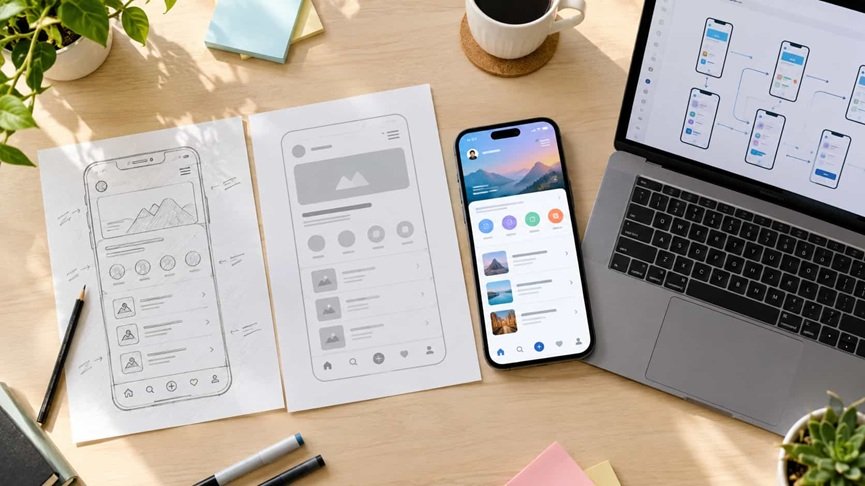
A Simple Step-by-Step Design Process
Strong mobile app interface design rarely happens by accident. Most successful teams follow a process like this:
- Research your users. Interview real people, study competitors and define the main problem your app solves.
- Map the user flow. Sketch the path from opening the app to completing the key task, and remove any step that isn’t needed.
- Create low-fidelity wireframes. Use simple boxes and text to test layout ideas quickly without worrying about visuals.
- Build a style guide. Define colors, fonts, spacing, icons and button styles before designing full screens.
- Design high-fidelity screens. Apply your visual system and add real content, not placeholder text.
- Prototype and test. Create a clickable prototype and watch people use it. Where they hesitate shows you what to fix.
- Hand off and refine. Share specs and assets with developers, then keep improving based on analytics and feedback.
Common Mistakes to Avoid
- Overloading screens. If a screen feels crowded, split it or remove elements.
- Tiny tap targets. They cause frustration and accidental taps.
- Hiding key features. Mystery icons without labels force users to guess.
- Ignoring empty and error states. A blank screen with no guidance feels broken.
- Long, demanding onboarding. Let people explore first and teach features in context.
- Skipping real-device testing. Screens look different on a small budget phone than on a large flagship.
Helpful Tools for Designers and Teams
- Figma: collaborative design, prototyping and component libraries
- Sketch and Adobe XD: popular alternatives for UI work
- Maze and UserTesting: gather feedback from real users
- Lottie: lightweight, smooth animations
- Stark: contrast checking and accessibility review
Frequently Asked Questions
What is the difference between UI and UX in mobile apps?
UI is the visual and interactive layer: buttons, colors, layouts and typography. UX is the overall experience, including how easy it is to reach a goal. UI is part of UX, and both work best when designed together.
What makes a mobile app interface user-friendly?
A user-friendly interface has clear navigation, readable text, large touch targets, consistent elements, helpful feedback, and accessible design. Users should be able to complete key tasks without instructions.
How many screens should a mobile app have?
There is no fixed number. Focus on the shortest path to the user’s goal. Many successful apps have only a handful of core screens, with extra ones supporting them.
Which font size works best for mobile apps?
Aim for at least 16px for body text. Headings can range from 20px to 32px depending on hierarchy and always support the user’s system text-size settings.
How do I test my app design before development?
Build a clickable prototype in a tool like Figma and ask five to eight target users to complete real tasks while you observe. You will usually uncover the biggest problems quickly.
Should I design for iOS or Android first?
Start with the platform where most of your audience is. If unsure, check analytics or market data for your region, then adapt the design for the second platform.
Conclusion: Design for People, Not Just Pixels
Great mobile app interface design comes down to empathy. When you understand what users want to do, remove everything that gets in their way, and give clear feedback at every step, the interface almost disappears and the experience feels natural.
Start small. Pick one screen in your app, apply the principles above, test it with a few real people and improve what you learn. Small, steady improvements compound into a product people trust and recommend.
Ready to put this into practice? Sketch your main user flow today and see which step could be simpler.