Ever opened your own product and spotted three slightly different blue buttons? It happens to almost every growing team. Designers redraw the same card, developers copy old code, and every new feature takes a bit longer than the last. A modular design system is the cure: it breaks your interface into small, reusable parts that snap together in predictable ways.
What Is a Modular Design System?
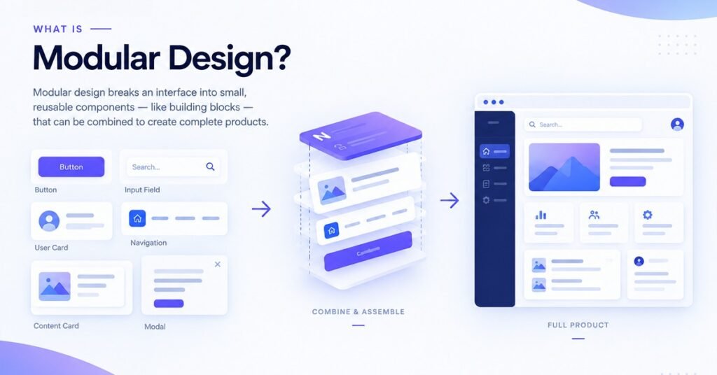
A modular design system is a set of reusable, independent UI building blocks and the rules for combining them, so teams can design and ship consistent interfaces without reinventing the basics.
Picture a box of LEGO. Every brick is simple, yet the way bricks connect lets you build almost anything. Buttons, inputs, and cards are your bricks. Spacing, color, and typography rules are the studs that hold them together.
It’s also more than a style guide. A style guide describes how things should look. This approach gives you working, versioned pieces that designers and developers can use right away.
The Four Layers That Make It Work
Most well-organized systems follow the same structure, moving from smallest to largest. The idea borrows heavily from atomic design.
Design tokens
Tokens are named values for color, type size, spacing, radius, and shadow. Instead of hard-coding a hex value everywhere, you reference something like color-primary. Change it once and the whole product follows.
Components
Buttons, form fields, modals, and menus live here. Each reusable UI component has clear states, such as default, hover, focus, disabled, and error, and is documented once.
Patterns
Patterns combine components to solve a recurring problem, like a search field with filters or a checkout form with validation.
Templates
Templates arrange patterns into full layouts such as dashboards, settings pages, or pricing screens.
Because the layers stay separate, you can restyle a product by editing tokens or swap a single component without breaking the rest.
Why Teams Adopt a Modular Design System
Speed. Designers assemble screens from approved parts, and developers reuse tested code. Less duplicate work means shorter build cycles.
Consistency. People trust products that behave the same way everywhere. Shared rules for spacing, color, and interaction build that trust and strengthen your brand without constant policing.
Scalability. New features become a matter of composing existing pieces. That’s what makes scalable UI realistic as your team and product grow.
Accessibility. When contrast, focus states, and keyboard behavior are built into each component, accessibility ships by default rather than as a late patch.
Easier onboarding. New hires learn one clear system instead of decoding years of mismatched screens.
How to Build One, Step by Step
1. Audit your current interface
Screenshot every screen and group similar elements. Expect a dozen shades of blue and five kinds of buttons. That inventory shows what needs standardizing.
2. Choose a small set of tokens
Pick a deliberate palette, type scale, and spacing steps. Fewer options lead to better decisions.
3. Start with the most-used components
Begin with buttons, inputs, and typography. A modular design system earns trust by being useful early, not by being complete.
4. Document as you go
Add a short description, usage guidance, do and don’t examples, and code for each component. Documentation is what turns a folder of assets into something people actually use.
5. Assign ownership
Decide who approves new components, how changes are proposed, and how releases are versioned. Good design governance keeps the system from drifting back into chaos.
6. Track adoption
Measure how many screens use system components versus custom ones. That number tells you whether the work is paying off.
Mistakes to Avoid
- Building too much too soon. Start small and grow from real needs.
- Leaving developers out. If designers work alone, the code won’t match. Bring in front-end developers early.
- Treating it as a one-time project. A modular design system is a product that needs owners, a roadmap, and regular updates.
- Making components too rigid. If teams can’t adapt a piece to real cases, they’ll route around it.
- Skipping documentation. Undocumented components get misused or rebuilt.
Tools Worth Considering
- Figma for shared component libraries and variables
- Storybook for documenting and testing coded components
- Style Dictionary or Tokens Studio for syncing design tokens between design and code
Choose tools your team will actually open every day. The best setup keeps design files and code in sync.

Frequently Asked Questions
What is a modular design system in simple terms?
It’s a collection of reusable UI pieces and shared rules that help teams build consistent products faster. Each piece works on its own and combines with others predictably.
Is it the same as a component library?
No. A component library is one part of the whole. The full system also includes tokens, patterns, guidelines, and governance.
How long does it take to build?
A starter version with tokens and core components can take a few weeks. A mature one keeps evolving as the product grows.
Is it worth it for small teams?
Yes. A lightweight version prevents duplicate work early, when changes are cheapest.
Does it limit creativity?
Not when done well. Removing repetitive decisions frees designers to focus on real user problems.
Conclusion
A modular design system isn’t about restricting your team. It gives them a dependable foundation so they can move quickly and keep quality high. Audit what you have, define your tokens, build a handful of core components, and write things down as you go. Treat it as a living product and it will keep paying you back in speed, consistency, and a better experience for users..